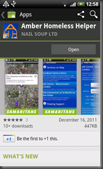
In Autumn 2011 I was approached by Nail Soup Ltd. about an Android development opportunity. Nail Soup had a client, a charitable organisation called Amber Foundation, who wanted some mobile applications built. Primarily they wanted to offer a free iPhone and Android app that would allow people to search for various types of resources to help homeless people in the UK. This was to be called the Amber Homeless Helper and was set to be released shortly before Christmas 2011.
The idea was to have a web-resident database sat behind a web service that could be queried with various different search criteria to get resources around a specified location. Nail Soup were happily building the web service, a web front end and also the iPhone app, and they asked me to build the equivalent Android application. Since at the time it was very close to the release of Oxygene for Java I chose that as the development tool for the job.
The app was completed and published for the target release date of 19th December 2011 and the iPhone and Android versions are in the Apple App Store and the Android Market respectively, though they are only visible to people in the UK since they are providing UK-specific resources.
Amber Homeless Helper is the first published app built with Oxygene for Java and was fun to do. It’s not the most complex application, primarily being a search tool with some additional information and the ability to contact Amber and donate to the charity, as well as look at previous archived search results but involved a number of technically interesting aspects of Android development. Additionally it acted as a good test of the initial 1.0 release of Oxygene for Java finding a couple of rough edges that were quickly addressed by the developers at RemObjects.
This post is intended to give an overview of what areas of Android programming were involved in getting the Amber Homeless Helper to its finished state, operating as the design dictated.
On start-up you can immediately see a couple of things about the app, even if we ignore the splash screen (shown at the top of this blog post). Firstly, it uses a tab widget to allow the five main screens (aka activities) to be selected. This is quite straightforward to set up in the main activity layout and main activity class.
Secondly, it departs from the typical default Android colour schemes of white on black (or black on white) and uses colours more associated with Amber Foundation. This required using a custom application theme in a theme.xml file and some custom styles in a styles.xml file applied. In fact, just to check I could achieve it (and this wasn’t in the specification) I built in the custom colour scheme in a manner that allowed me to turn it on and off by selecting or deselecting the custom theme.
It turned out this was mostly very straightforward. The slightly sticky part involved the tabs. In the colourful version of the app these are custom-drawn to allow the gradient backgrounds to be achieved and to round off the tab corners. In the original version of the app they are the stock tab widget. So some conditions were added into the main activity to differentiate between a custom theme or the default theme, which itself was identified using the value of a custom attribute (defined in an attrs.xml file) used in one of the styles. Other than that the theming is automatic.
Another thing evident on start-up is the application icon being inserted into the status bar. This is a nice little touch achieved by calling:
requestWindowFeature(Window.FEATURE_LEFT_ICON);
before loading up the activity layout and then afterwards calling:
FeatureDrawableResource[Window.FEATURE_LEFT_ICON] := R.drawable.amber_app_icon;
Clicking the information buttons on the home page brings up typical Android dialog style views, achieved by applying the Theme.Dialog theme to the activity that displays the explanatory text.
The Search page is the main focus of the application. It’s where most of the functionality is invoked from and set up for.
The available service categories are not hard-coded. On first run they are sucked in from the web-resident database via a web service call and stored in a local SQLite database. When the app starts up a custom Application object starts the ball rolling by checking if the categories in the remote database are more up to date than what we have locally. If so, it queries the database to get the new categories and records when they were updated.
By this time the user may already have gone to the search screen so to communicate the new information over the custom Application object broadcasts a custom Intent. The search page has a broadcast receiver registered in case such an Intent comes along so it can update the service category list onscreen.
The web service is SOAP-based so I used kSOAP2 to communicate with it. This was straightforward: just a case of referencing the kSOAP2 .jar file and then calling the relevant methods. Additionally, to ensure the UI experience wasn’t affected by the Internet communication all web service calls were set up to operate asynchronously in secondary threads.
When searching for resources in the app you can either enter a location and search within a specified radius, or use your current location. To support searching on the current location there’s code running in the background trying to identify where you are as soon as the Search page shows up, using either the coarse network cell-based location and/or GPS-based location identification. It continues to search, in an attempt to refine the location or keep track of where you are if you are moving, until you leave the Search page - as soon as the Search page is switched from in one way or another this location detection is disabled.
When you initiate a search with one of the search buttons your search criteria are collected: category, radius, location and optional additional advanced criteria. These are sent off to the web service to get some results.
The search results are available in two forms: a map and a list.
The red pins indicate matches on the sought categories, and the purple pins show other resources that may additionally be useful.
The map is implemented using Google's MapView control. However this control is not part of the Android SDK – it’s part of an add-on library that you need to pull down with the Android SDK Manager. You also need to add it to your project, specify you’re using it in your Android manifest file and take other steps to have it work at all. It requires you to have an API key, which you get from a Google web page after plugging in the MD5 fingerprint of the certificate used to sign your application.
Even if you don’t explicitly provide a certificate to sign your app with, it will still be signed using a debug certificate created when you first build with the SDK. But if your goal is to publish to the Android Market you may as well create a specific certificate, sign the app with that and use it to create the map API key. This API key needs to be given to the MapView control, either specified as an attribute in the layout file or passed as a constructor parameter.
If this all sounds rather convoluted and complicated that would be because it is rather convoluted and complicated. It’s a shame Google wanted to keep the map controls out of the open Android OS, but I’ll write more later on the technical specifics of using these map controls with Oxygene for Java.
The problems with maps don’t end there. When programming for iPhone and iPad with iOS the map control there has lots of pre-packaged functionality, including support for adding markers to the map that can be clicked on, yielding a nice balloon box with a title and text in and so forth. On Android we don’t get such niceties all ‘in the box.’ Apparently the iOS functionality was put together back in the days when Google and Apple were close allies and good working partners, before the days of Android. So iOS benefitted from the Google expertise, but for some apparently inexplicable reason, Google didn’t ensure their own map offerings for the Android platform matched in capability and richness.
The Amber app does achieve this popup balloon effect, however:
But it requires some work to do. Indeed a little search turned up an implementation of these map balloon views already done for Android users, so I made use of that work.
The map also has the search radius displayed as a circle on the map, so that involves another map overlay which I coded up and added to the map view.
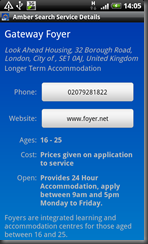
Tapping the balloon view opens another activity that displays the full details of the selected service:
Buttons on this page will dial the service provider telephone number and open its web site. Buttons on the Donate and Contact pages support donation through SMS and communicating with Amber via email. While it is quite feasible to have the Amber app actually send an SMS or display a web page or send an email or dial a telephone number, there are also good reasons why the app chooses to not directly do this. Instead it makes use of the inbuilt SMS app, web browser, email app and telephone dialler.
These jobs were delegated for a couple of reasons. Firstly any Android system already has all the required functionality in pre-supplied applications and it’s very common to mix and match bits of the Android system into an application to avoid reinventing the wheel. But perhaps more importantly if the app was coded to, for example, directly send an SMS using the SmsManager class then it would need SEND_SMS added to the app’s list of required permissions.
If the app was coded to directly dial a number it would need CALL_PHONE added to the permissions list. When someone looked at the app on the Android market they would see the app requires these permissions and might choose to wonder how legitimately the application behaved with regards to text messages and phone calls and maybe choose to not install it. Delegating to the inbuilt apps, which get launched with the basic information filled in, removes those permission requirements and still ensures the user is in control as they can discard the SMS before it is sent, or close the telephone dialler before the call is made.
The other tabbed page not mentioned so far is the Archive page. This displays the list of previous searches made, whose results have been stored locally in the SQLite database. When an archived search is chosen the app checks to see if Internet connectivity exists. If it does then the results are displayed on the map page, otherwise the results list page is displayed. Archived searches can be deleted either individually or en masse through a separate screen (invoked through a menu item).
All in all, the majority of the work in the app deals with reading and writing various bits of data from and to the database, and making the asynchronous calls to the web service. Various proxy objects are used to represent the search results and the list of found services that are returned to make things more manageable.
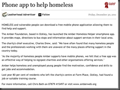
Since Amber Homeless Helper’s release it has got some press coverage:
- The Guardian’s Social pages on 20th December, 2011:
- The Wiltshire Times on 23rd December, 2011:
- The West Sussex County Times on 30th December, 2011:
- This is Surrey Today on 30th December, 2011:
The app took a couple of weeks to build (albeit with my previous experience of the Android SDK and how Android applications work in general) and we spent a couple more weeks testing it out and tweaking things and fixing bits, but it was a pleasingly short development cycle. I’ve found that Oxygene for Java makes an ideal tool for the Delphi developer to jump into the Android development world.
You can find the Amber Homeless Helper, if you’re UK-based in the Apple App Store here and in the Android Market here.


No comments:
Post a Comment